
Accessing USGS water data with QGIS
The USGS Water Data APIs implement the OGC API - Features standard in order to increase the interoperability of USGS water data with other tools and data sources. One example of this interoperability is that it's possible to query and download USGS water data from most GIS systems, which frequently support reading directly from OGC API - Features APIs and adding their data to maps.
This tutorial walks through the specific steps required to access USGS water data within QGIS, a popular open source GIS tool. It assumes you already have QGIS installed and are familiar with how to navigate and symbolize data. More information about QGIS can be found in the QGIS user manual.
Connecting to Water Data APIs from QGIS
The first thing we need to do is configure the Water Data API server as a "WFS / OGC API - Features Layer" provider in QGIS.
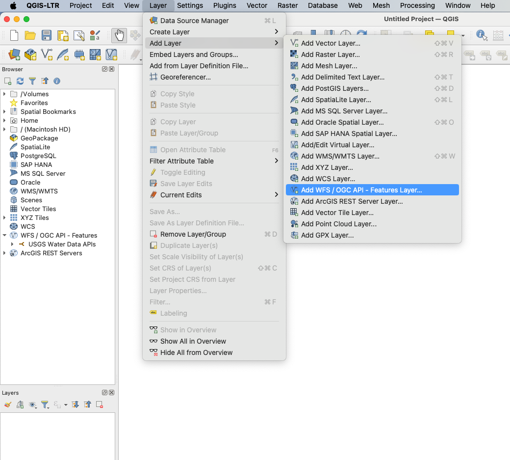
In a new project, we'll open the the "Layer" menu, navigate to the "Add Layer" submenu, and then click on the "WFS / OGC API - Features Layer" item:
This will open up a window that we can use to add a new server connection:
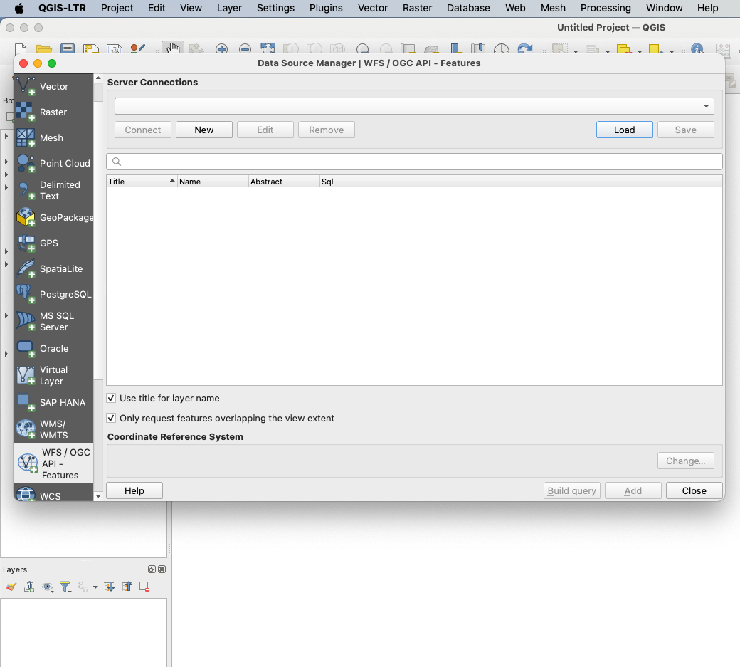
Click the "New" button under "Server Connections" to open another window, which will let us define our connection:
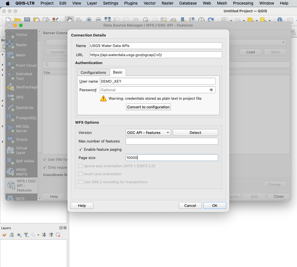
In this window, we need to fill out a few key pieces of information:
- Under "Name", we provide a friendly name that will indicate which server we're connecting to.
- Under "URL", we provide the URL of the Water Data APIs, https://api.waterdata.usgs.gov/ogcapi/v0/ .
- In "Authentication", we click the "Basic" tab and provide our API key in the "user name" field, leaving "password" blank. You should provide your own API key here; if you don't have one, you should first create a new key at this link.
- Clicking the "Detect" button next to "Version" will automatically detect that the Water Data API server is an OGC API - Features server.
- And last but not least, we should provide a maximum page size for QGIS to use. The maximum value here is 10000, which is a good choice for most users. If you're on a slow or unreliable internet connection, making complex queries, or finding that your queries are timing out, consider dropping this value until your requests reliably succeed.
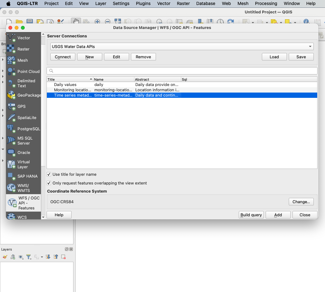
Once we provide those, we can close this window with "OK" and then press "Connect" under "Server Connections" to see the data collections available from the Water Data API server:
Querying the time series metadata collection
We're now able to access data from any of these collections in QGIS. Because these are large data sets, it's important that we filter our downloads to just the data that we're interested in; otherwise, we might freeze QGIS by trying to download too much data, or get rate limited by making too many requests to the APIs.
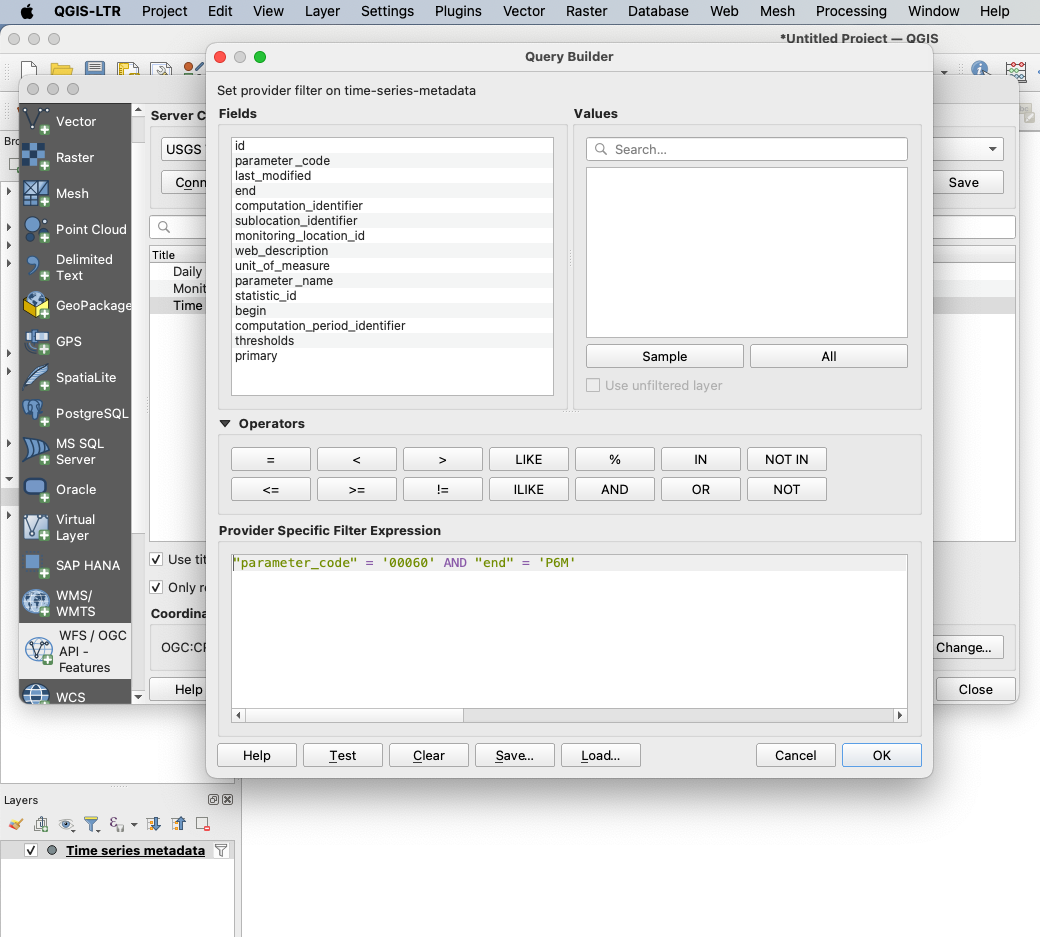
Say, for instance, we wanted to get a map of all the time series which measured discharge in the last six months. We can do this by clicking on the "time-series-metadata" endpoint in the list, then clicking the "Build Query" button.
This will open a new window that lists the different fields we're able to query on. In the "Provider Specific Filter Expression" box, we'll write out the query that we want to run out against our APIs:
"parameter_code" = '00060' AND "end" = 'P6M'
This query will let us find all time series measuring discharge ("parameter_code = 00060") which have been active in the last 6 months ("end = P6M", meaning that the most recent data from this timeseries is in the past "Period of 6 Months").
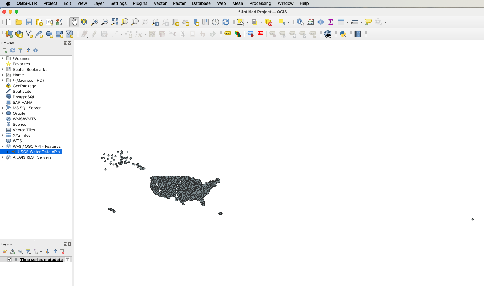
Hit "OK" to close the query builder window and on the Data Source Manager window, click "Add" to load the data to a new layer on the map. This will display point data for recent discharge measurements. Click "Close" on the Data Source Manager window.
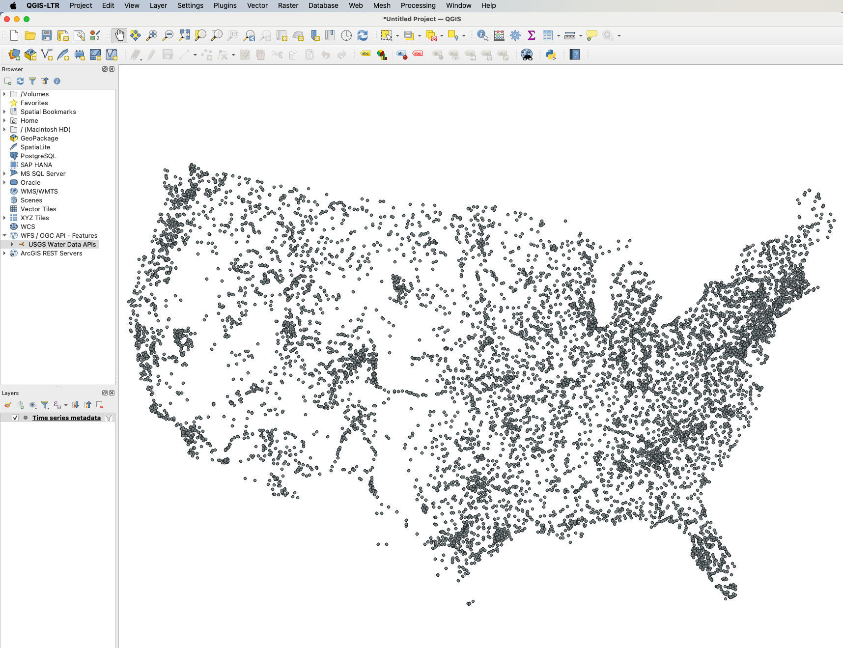
For display purposes, we're going to change the coordinate reference system of our map to use the EPSG:5070 coordinate reference system for the rest of this tutorial. We're also going to zoom into the continental United States to make individual time series more evident:
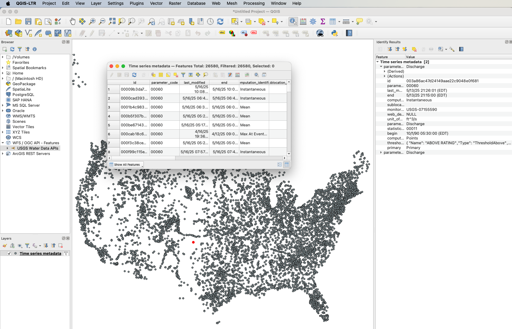
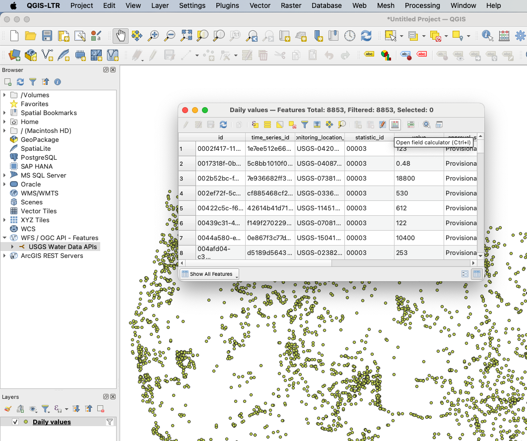
In addition to location information, the points on this map include the full set of data associated with each observation. We can see these values by opening the Attributes table by right clicking the layer's name in the Layers window, or by highlighting a single point with the Identify Features tool.
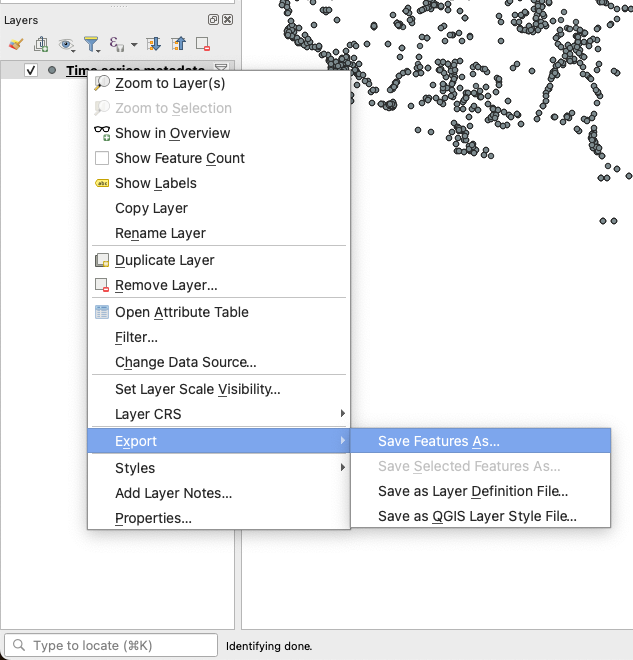
You can export this data using the "Save Features As" menu, accessed by right-clicking the layer name in the layer viewer:
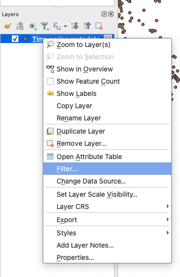
If you want to edit the query a layer is using, right click on the layer's name in the Layers window and click "Filter" to return to the Build Query menu.
Querying the daily values collection
If we want to add a different layer to our map -- for instance, if we wanted to view daily values -- we first need to reopen the Connections menu, going through the "Layer" menu into the "Add Layer" submenu and then clicking the "WFS / OGC API - Features Layer" item.
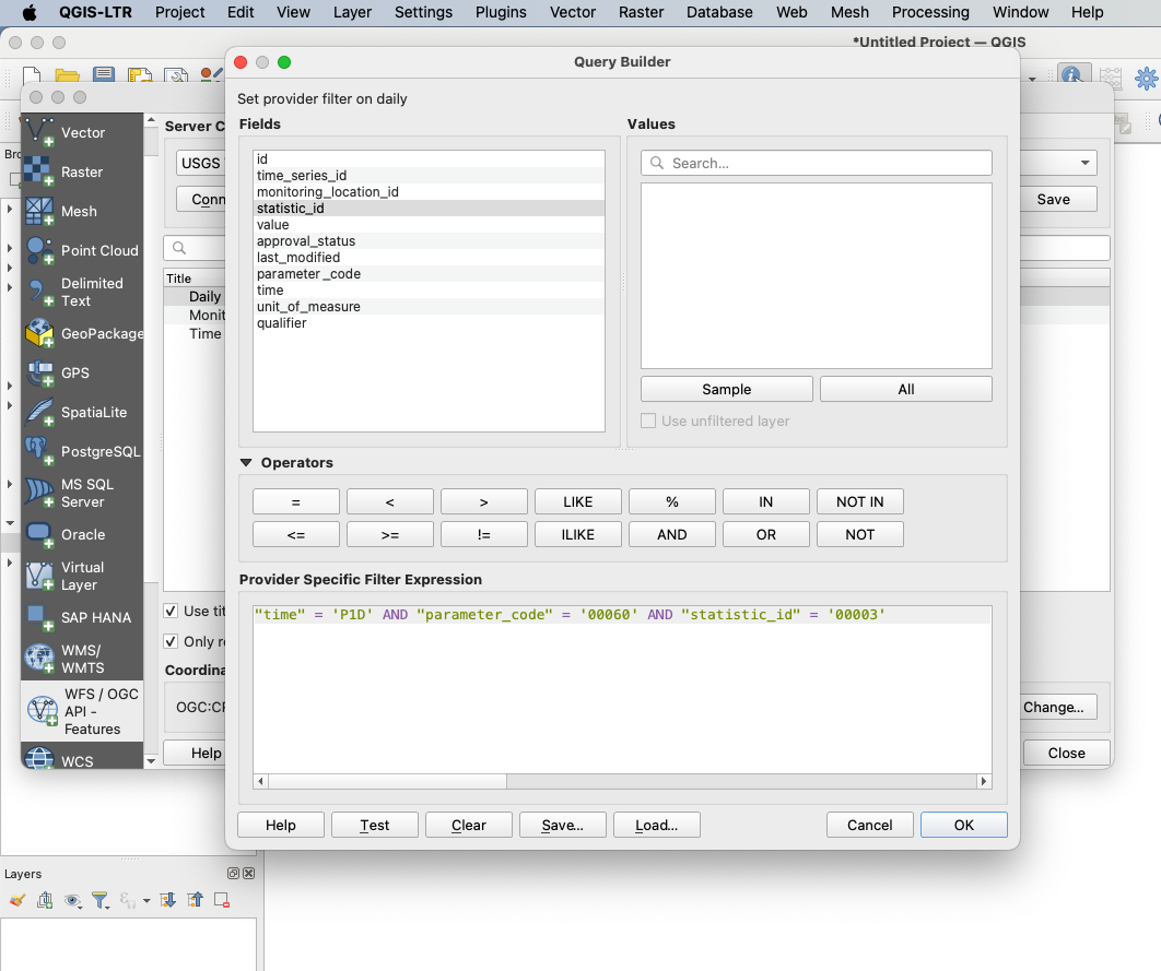
We might need to "Connect" to the Water Data APIs server again, but we shouldn't need to re-define our connection. By clicking on the "Daily" collection and then clicking the "Build Query" button, we can then start building a query against the daily values endpoint. Because this endpoint contains a large amount of data, it's important that we filter down to just the data that we're interested in, which we'll do using the query:
"time" = 'P1D' AND "parameter_code" = '00060' AND "statistic_id" = '00003'
This query will filter our results down to just the mean ("statistic_id = 00003") discharge ("parameter_code = 00060") daily values from the past day ("time = P1D" -- that code meaning that we want data from "a Period of 1 Day"):
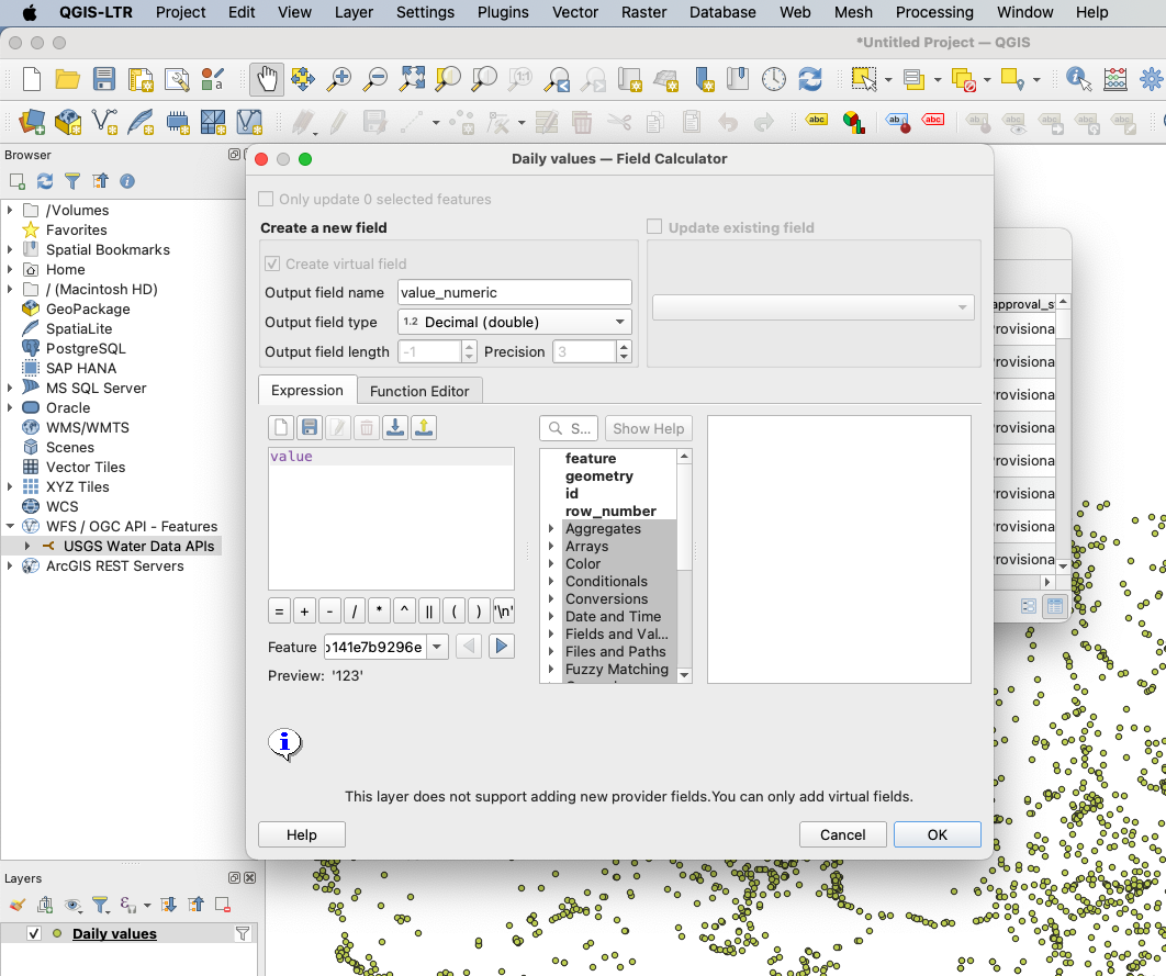
One thing to note is that these APIs store most numbers, including daily values, as string objects to preserve significant figures and avoid issues with rounding on different computers. As such, if you want to symbolize your map based on these numbers, you'll first need to create a virtual field that converts the string into a decimal value.
From the attributes table of the layer, we'll open the Field Calculator menu:
In this menu, we create a virtual field with the "Decimal (double)" type. Our expression to create this field is just the name of the field we want to convert. In this example, because we're going to symbolize our map based on the "value" field, we'll input "value" in the "Expression" box:
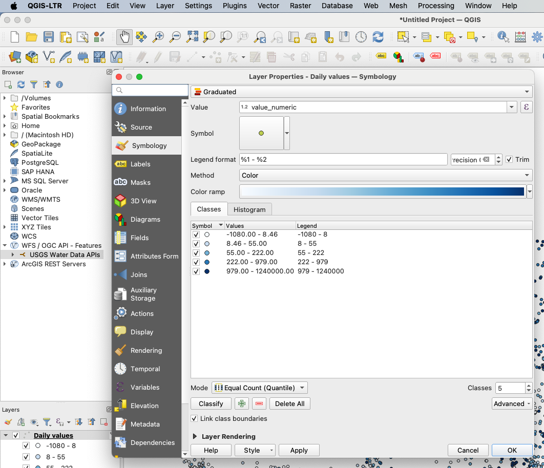
We can then use our virtual field to symbolize the data. Once the field is created, close the attribute table, right-click on the Daily values layer and go to Properties. It should default to the Symbology tab, but if it doesn't, it's the third option down on the left. Change from the default "Single Symbol" to "Graduated." Change the value to the newly created "value_numeric" field. Using the default settings, click "Classify" to auto-generate 5 classes in Equal Count (Quantile) mode. We'll also change the color ramp used to the "Blues" ramp instead.
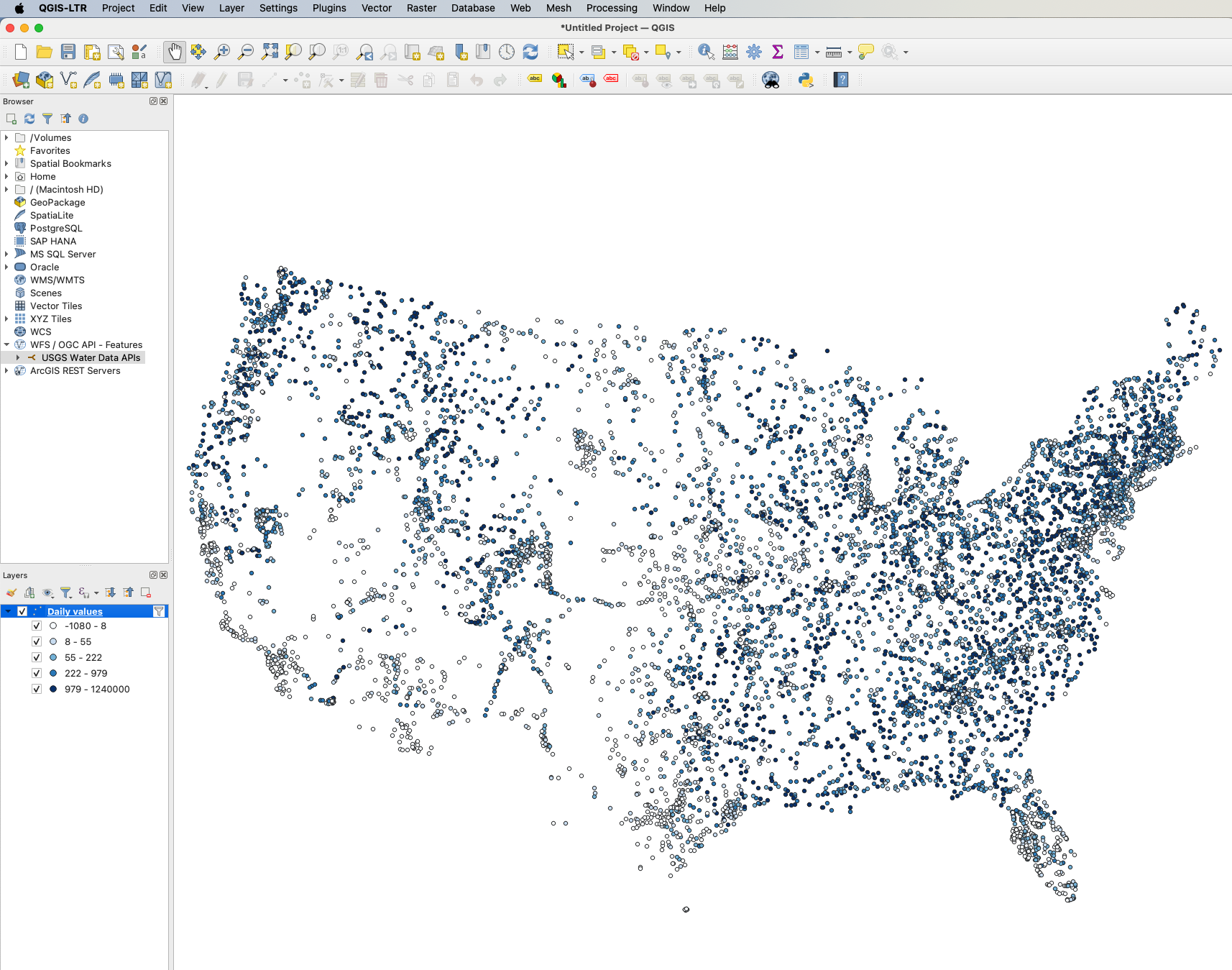
This process then lets us symbolize our maps using numeric fields as we'd expect:
These tools should allow you to query and visualize any data provided by the USGS OGC API - Features endpoints. More information about the data available from each endpoint can be found on the endpoint schema pages; for example, this page lists the data returned by the daily values endpoint, while the time series metadata endpoint is documented here.